This is how to Design Power BI Dashboard & Unlock the secrets to crafting an impressive Power BI dashboard with our comprehensive step-by-step guide. Learn the art of data visualization, organization, and interactivity to create captivating dashboards that deliver actionable insights. Discover expert tips and best practices for designing your Power BI masterpiece. Start designing your impactful dashboard today!
Table of Contents
Introduction | How to Design Power BI Dashboard
In today’s data-driven world, businesses rely heavily on data visualization tools to make informed decisions. Power BI, developed by Microsoft, is one such powerful tool that enables users to transform raw data into interactive and insightful dashboards. In this article, we will explore the art of designing an effective Power BI dashboard that not only presents data but also communicates valuable insights clearly and intuitively.
What is Power BI Dashboard?
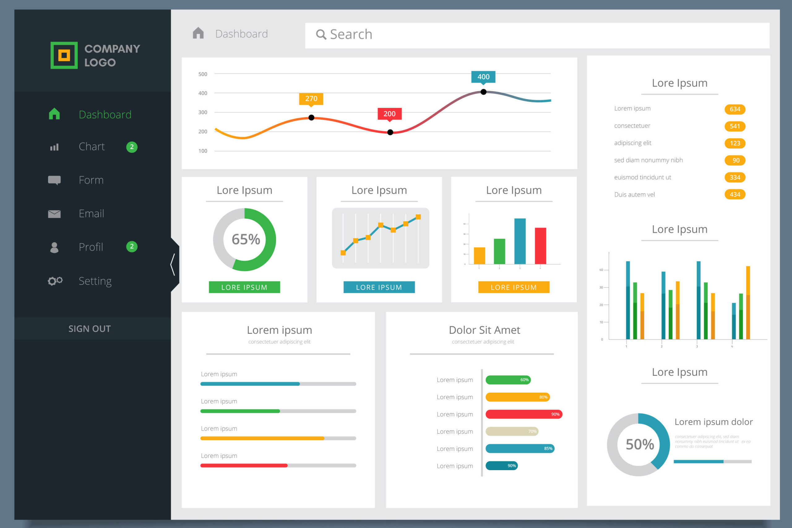
Before diving into the design process, let’s understand what a Power BI dashboard is. A Power BI dashboard is a visual representation of data, often consisting of charts, graphs, tables, and other visual elements, that provides a comprehensive overview of key performance indicators (KPIs) and metrics. It allows users to monitor trends, spot patterns, and gain actionable insights from complex datasets.
Why is Dashboard Design Important?
The design of a Power BI dashboard plays a crucial role in its effectiveness. A well-designed dashboard enhances user experience, facilitates data comprehension, and ultimately aids in better decision-making. A poorly designed dashboard, on the other hand, can lead to confusion, misinterpretation, and a lack of engagement.
Understanding Data Visualization
Importance of Visuals in Dashboards
Humans process visual information more efficiently than text or numbers. Therefore, incorporating effective visuals in a Power BI dashboard is essential. Visual elements like charts, graphs, and icons help users grasp complex data relationships at a glance.
Choosing the Right Visualizations
Selecting the appropriate visualizations is key to conveying information accurately. Bar charts, line graphs, pie charts, and maps each serve specific purposes, and designers must choose wisely based on the data being presented.
Designing a User-Friendly Dashboard
To ensure that your Power BI dashboard is user-friendly and impactful, follow these design principles:
Define the Purpose and Audience
Understanding the purpose of the dashboard and its intended audience will guide the design process. Different stakeholders may have different data requirements, so tailor the dashboard accordingly.
Organize Data and Information
A well-organized dashboard makes it easy for users to find the information they need quickly. Arrange data logically and use clear headings and labels for different sections.
Keep it Simple and Intuitive
Avoid clutter and unnecessary complexity. Keep the design clean and intuitive, allowing users to interact with the dashboard effortlessly.
Utilize Filters and Interactivity
Adding interactive features like filters and slicers empowers users to explore the data further and extract personalized insights.
Best Practices for Power BI Dashboard Design
To create visually appealing and efficient dashboards, adhere to these best practices:
Consistent Color Schemes
Maintain a consistent color scheme throughout the dashboard to create a harmonious visual experience.
Effective Use of White Space
White space or negative space helps prevent visual overload and directs the user’s focus to the most critical data points.
Mobile Responsiveness
Ensure that the dashboard is responsive and adapts well to different screen sizes, including mobile devices.
Performance Optimization
Optimize the dashboard’s performance to minimize load times and ensure a smooth user experience, even with large datasets.
Storytelling with Data
Data storytelling is a powerful technique to convey insights effectively. Consider the following:
Creating a Narrative Flow
Present data in a logical sequence that tells a story, leading the user to meaningful conclusions.
Using Annotations and Insights
Adding annotations and call-outs to highlight significant points helps users understand the context behind the data.
Incorporating Advanced Features
Advanced features enhance the dashboard’s functionality and user experience:
Drill-Down Functionality
Allow users to drill down into specific data points for deeper analysis and understanding.
Hierarchical Navigation
Implement hierarchical navigation to structure the dashboard and enable users to explore data from different angles.
Custom Visualizations
Explore custom visualizations and plugins to cater to specific data visualization needs.
Tips for Data Accuracy and Reliability
Maintaining data accuracy and reliability is crucial for a successful dashboard:
Data Validation and Cleaning
Regularly validate and clean data to ensure accuracy and eliminate errors.
Refresh and Update Frequency
Set up regular data refreshes to keep the dashboard up to date with the latest information.
Testing and Feedback
Gather feedback and conduct tests to improve the dashboard:
A/B Testing
Perform A/B testing to compare different dashboard designs and layouts.
User Feedback and Iteration
Incorporate user feedback to make iterative improvements to the dashboard.
Dashboard Deployment and Sharing
Before sharing the dashboard, consider the following:
Security Considerations
Ensure that sensitive data is appropriately secured before sharing the dashboard.
Sharing Options in Power BI
Explore different sharing options in Power BI, such as embedding and publishing to the web.
Monitoring and Maintenance
To ensure the dashboard remains effective over time:
Tracking Dashboard Performance
Monitor dashboard usage and performance to identify areas for improvement.
Addressing Changes in Data and Business Needs
Adapt the dashboard to reflect changes in data sources and evolving business requirements.
Conclusion
Designing an effective Power BI dashboard requires a thoughtful approach that aligns with the dashboard’s purpose and the needs of its audience. By following best practices in data visualization, storytelling, and usability, you can create powerful dashboards that deliver valuable insights and drive data-driven decision-making.
FAQs
- Q: Is Power BI suitable for small businesses? A: Absolutely! Power BI offers plans and features suitable for businesses of all sizes.
- Q: Can I collaborate with others on a Power BI dashboard? A: Yes, Power BI allows for collaboration and sharing among team members.
- Q: Does Power BI support real-time data? A: Yes, Power BI can connect to real-time data sources for up-to-the-minute insights.
- Q: Can I embed Power BI dashboards on my website? A: Yes, Power BI provides embedding options to integrate dashboards into websites and applications


Informative Blog
[…] Step-by-Step Guide – […]