Table of Contents
How to add Dax Measure on the X-Axis of Power BI?
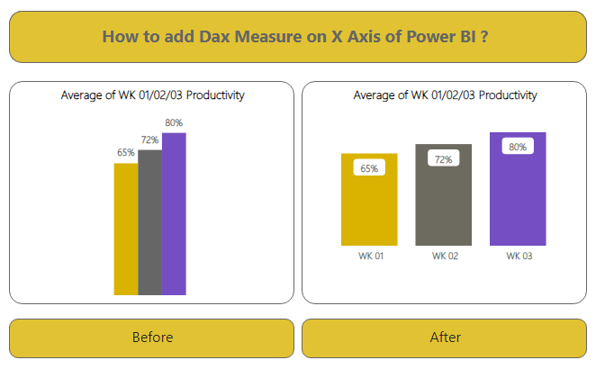
Add Dax Measure on the X-Axis of Power BI Clustered Column Chart result as shown in Visual 1 named “Before” of the above Image. This Representation is not very informative and also does not give a clear Picture. In this blog, we will learn How to add Dax Measure on the X-Axis of Power BI with Custom Labels on X-Axis.
Data Source –
We opted for an Excel file as our data source. This file has 5 columns: Agent Name, Client Name, WK 01 Productivity, WK 02 Productivity, and WK 03 Productivity. You can observe this arrangement in the image below. add Dax Measure on the X-Axis of Power BI

Goal – To add Dax Measure on the X-Axis of Power BI
We aim to display the productivity of WK 01, WK 02, and WK 03 using a Clustered Column Chart. This chart will feature labels for WK 01, WK 02, and WK 03, along with their corresponding average productivity, all on the X-Axis. You can see the outcome of this effort in Visual 2 labeled “After” in the image above. Now, let’s get started.
Step-by-Step Guide –
- Begin by importing our Excel file into Power BI.
- We’ll create custom labels for our measures: WK 01, WK 02, and WK 03.
- Click on the “Enter Data” option in the Home Menu. (As depicted below).

- Add 2 columns in the table, naming them “WK Label” and “Sort”.
- Label the table as “Label for Measures”.
- Complete the process by clicking on “Load”.

- A new table will be generated, serving as labels for our measure values on the X-axis.

- Now, let’s craft a measure using the “SWITCH” formula. This measure will not only calculate the average productivity of WK 01, WK 02, and WK 03, but also establish a connection between the labels in the measure table and the productivity averages.

DAX For Productivity = SWITCH ( SELECTEDVALUE(‘Labels For Measures'[WK Label]),
“WK 01”,AVERAGE(Demo[WK 01 Productivity]),
“WK 02”,AVERAGE(Demo[WK 02 Productivity]),
“WK 03”,AVERAGE(Demo[WK 03 Productivity])
)
- Proceed to drag and drop “WK Label” from the “Label For Measures” table to the X-Axis of the Clustered Column Chart. Simultaneously, place the newly created measure on the Y-Axis.
- And that’s it. We have successfully attained our visual with the DAX measure.


